Trailers
|
Horror
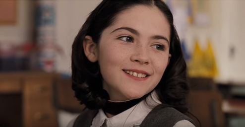
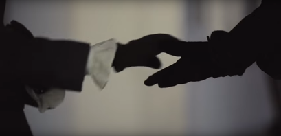
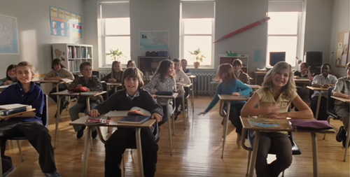
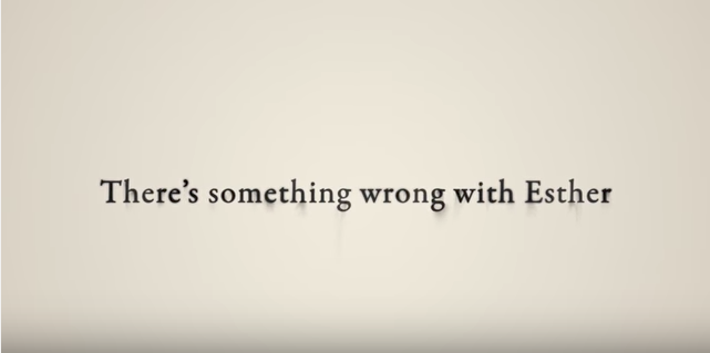
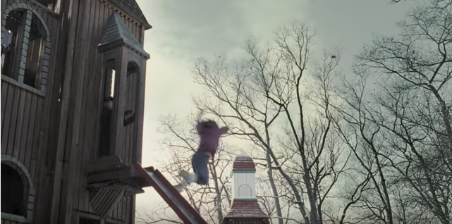
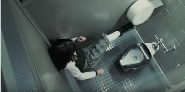
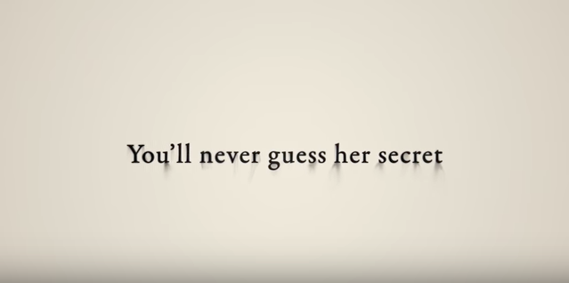
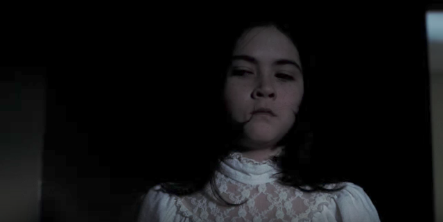
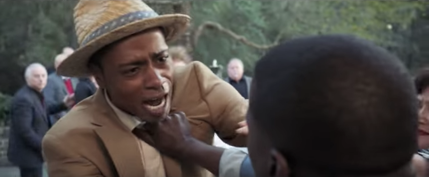
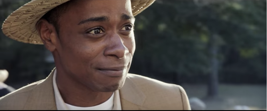
Orphan is a horror film from 2009. It's trailer starts very slow paced, having shots where the lighting is quite bright to make things seem normal. the only indication we get of this movie being a horror is the idents of the production company, the Warner Bro's in particular as it is blue, rather than it's usual golden colour. During one of these brighter scenes that flash up, we meet a young girl, Esther. We get the impression that she is one of the main characters as, when we meet her, we see a whole conversation go on between her and a couple, as though she slows down the trailer so that we can actually 'talk' to her. The other main character introduced is the 'mother' who is looking to adopt. The reason that the audience may think she is the main character is because she is the first person we properly see as a close-up, therefore she is important. Aside from the idents, the first implication that not all is well with this girl is a brief shot of her silhouetted hand reaching out to hold what we can assume is her mum's. The sudden darkness of the shot is a complete contrast to the soft, calm lighting of before. This shot is followed by one of the Mum walking away, holding Esther's hand. The previous one might indicate to the audience that something bad is going to happen when Esther is adopted. The next bit of the trailer shows Esther settling into her home, meeting the rest of the family and going to school. It is here when the whole trailer changes. We get a clip of Esther being laughed at in school and her smile fades. After that, everything is dark and ominous, while Esther's behaviour, from the good girl at the start, changes. The scenes of her in the bathroom she her sudden erratic and violent nature, coupled with the grey, dark tones of the setting demonstrating the shift in tone. The title cards further emphasise the idea the Esther is not what she seems. The first one says 'There is something wrong with Esther.' There could not be a blunter or more obvious statement about her character. We know that something is up, but the trailer does not tell us exactly what. Even in a later title card, we are almost teased with knowing what's wrong 'You'll never guess her secret' which uses a direct address to the audience. This creates intrigue, as we are drawn to the question, having seen that there is something wrong with Esther, we want an answer. Just before this title card, however, we get an idea of why people are starting to believe that something is wrong with Esther. We hear a voice over of someone saying 'trouble has a way of finding her.' The trouble that we see is her at a playground, watching a girl and then following her up one of the climbing frames where the girl apparently falls off, or is pushed. The implication of Esther killing this girl and it being called 'trouble' shows just how dangerous she is, yet we still don't know exactly what's wrong with her. |
|
Action
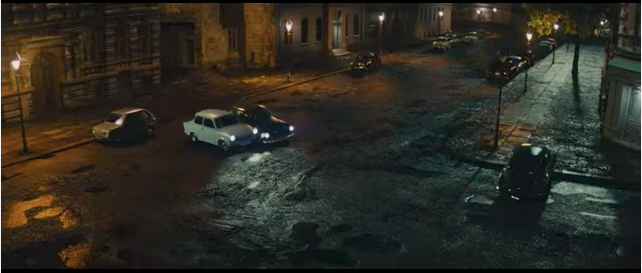
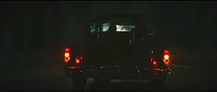
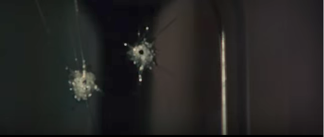
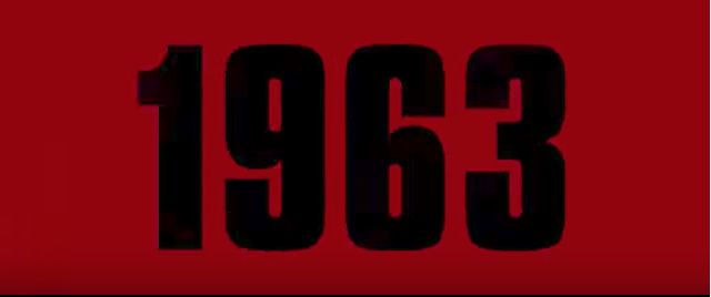
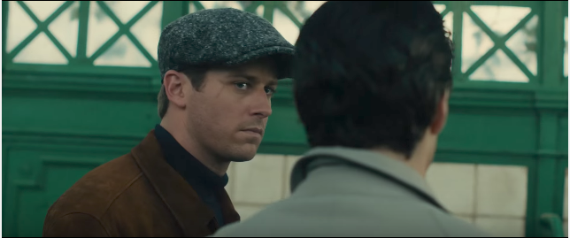
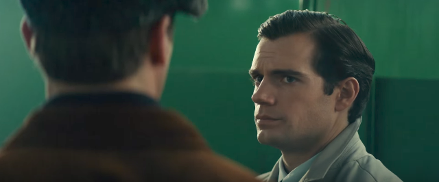
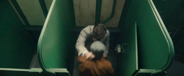
The Man From UNCLE is a spy movie from 2015, set in the cold war and is based on a TV show from 1964. The trailer begins by setting the genre. It does this by using conventions of a spy movie, such as car chases, guns, men in suits, fighting. Even at the very start, we get a car chase with a man in a suit giving instructions to a woman very calmly as he sets up a gun. The lack of a soundtrack here, with only the sound of a car driving down a very quiet street suggests that these characters are going to be disturbing the peace of this place, which is usually what happens in an action movie. Again the shot of the gunshots in the car window adds to the conventions and sets up the danger aspect of the movie. Once this happens, the music picks up, and it's quite upbeat, which could suggest that this movie isn't all serious action, it has some comedic bits in it, setting it apart from other spy films, as they are often quite gritty and take themselves very seriously. Next, we get images and title cards that give the audience quick insights into context, with newspaper clippings, dates (such as the 1963 one) and diagrams alluding to the cold war. Therefore, we are effectively being placed in a time that a lot of us recognise as one famous for it's spies and espionage- like the James Bond films. This also gives an indication of who the enemy might be. As for main characters, we have already got an idea of who they might be. The man in the back of the car, who we assume might be important due to the fact that he gives orders and has a lot of time on camera. The latter is true for the girl in the car, as she gets a lot of screen time too. And even the man in the other car, we could assume he is going to be important as he appears in the start of the trailer. However, as this is a spy movie, some may think that he is just an expendable henchman as many movies like this have. Later on in the trailer, we are properly introduced to the first man, getting a name, 'Napoleon Solo,' and a bit of background information, which is given by the second man, making Napoleon seem well-known. Then we get the same for 'Illya' the Russian spy, that we assumed was the villain in the start of the trailer. Additionally, the plot is set up by having an American 'higher up' explain what is going on, as though they are giving the audience a mission, and then having a Russian 'higher up' explaining that Russian and America will have to work together. The fight between the two agents then shown almost directly after this, presents just how well this mission will go, while also creating an allegory for the two countries. |
|
|
Romantic
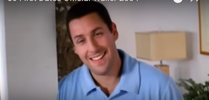
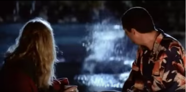
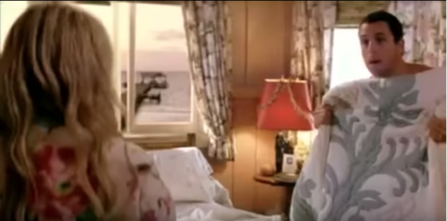
50 first dates is a rom-com that came out in 2004. It's trailer presents both aspects of it's genre to attract audiences, as a female audience may be more interested in the romantic side, while male and younger audiences might enjoy the comedy, which is emphasised in the beginning of the trailer by showing well known comedic actor Adam Sandler. He is obviously the main character, which means people who have seen his movies previously will go to see this one, being promised by his famous status, a certain quality of film and comedy. The soundtrack in the trailer is hugely important, as it's bouncy, cheesy tunes give a feel-good feel to what's happening, and adds to the comedy when all sound stops for a joke. Jokes are often a reason people go and see movies. if they like the jokes and think they are funny, they assume the film will be funny, or they might go back to see the context behind the ones in the trailer. The cuts in this trailer add to the understanding of the genre, which attracts audiences of rom-coms. For example, the use of wipes and dissolves give the film a dream-like quality, and also make it quite cheesy, as these cuts may not be used in a more serious, realistic genre. Also attracting an established fan base, the voiceover announces the names of the actors. This means that more attention is drawn to Adam Sandler and Drew Barrymore, both who were well known before the film. |
|
Sci-fi
Arrival is a sci-fi film that came out in 2016. It's teaser trailer is quite short and engaging, with a cliffhanger which attracts audiences as they want to know what they character has see. This tension is added to at the end of the trailer by a cut to the date on which the full trailer would be released, but the audience is still able to hear the character breathing heavily. We want to know what has her so nervous and scared, what these aliens look like and we want to know why they have arrived on earth. The main actor in this film is Amy Adams, and her importance in the movie is capitalised as she has the most screen time, the most dialogue and a voiceover. Even the other main character, played by Jeremy Renner- who's name comes up at the end of the trailer- does not get this treatment, instead has a short cameo appearance to tease his fanbase. |
|
Sub Genre Research
|
Phycological Thriller
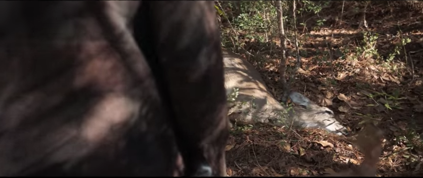
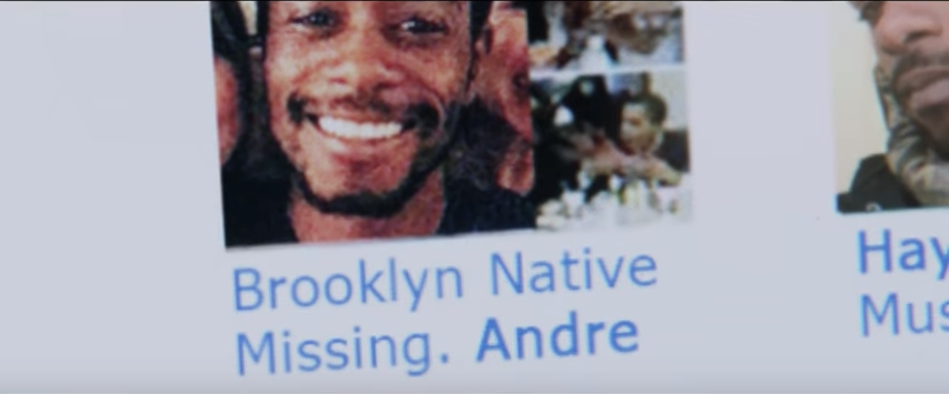
Get Out Is a recent thriller that was pretty well received when it came out in 2017. It's trailer is engaging and interesting, touching on themes of racism, the supernatural and showcasing its thriller conventions with an air of creepiness about it. One way in which this trailer goes about making us as the audience want to watch the whole movie is the creepy, quiet soundtrack that begins during the production company idents. It being slow and quiet while we're watching what appears to be quite a sweet, normal scene between a couple, suggests that something is not quite right. It sets the audience on edge, as the soundtrack doesn't match what is going on. This is one of the first indications that this is a thriller, as if it were something like a romance, you might have more happy or joyful sounding music, instead of creepy. After that, we are introduced to one of the themes, racism, which probably will attract different audiences to this type of thriller. Already with a black protagonist, a black audience might be attracted as many movies these days are whitewashed. As it deals with a more touchy subject, it may intrigue people with an interest in issues people face these days. However, the first proper indication that all is not well in this movie is a minor jumpscare of a car hitting a deer. The death straight away changes the tone of the trailer. After that, we are introduced to scenes more likely associated with the horror genre, with quick cuts and sharp, high pitched sound effects. However, the pace of the trailer remains quite slow, building up the tension. It speeds up more when one of the characters, who seems like a main supporting character, mentions other people going missing. This piece of important dialogue is heard while we see pictures of one of those who has gone missing. The trailer speeds up as the tension is rising, ready for a big reveal that will probably make the audience want to see the movie. The guy who appears to be missing, we see from several different angles as his mood changes, all in rapid succession. This suggests, if it wasn't already apparent that everything is not well with this character. Additionally, a cross cut is used here to show looming threat over the main character. The audience then gets to see a lot of action, which would attract fans of that genre, as they know what kind of action will be in the movie. thriller fans are also treated to some creepy and disturbing shots, all happening very quick so we get a sense of what's going on, but not a full plot or chronological order. Lastly, there are some shots we see more than once, bringing it back to the woman saying 'no' repeatedly. It brings out attentions back to what is going on and reminds us of the creepy imagery within the movie. |
|
|
Sci-Fi Thriller
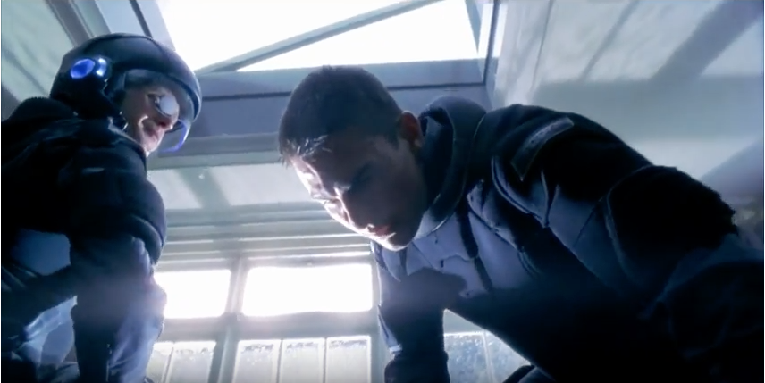
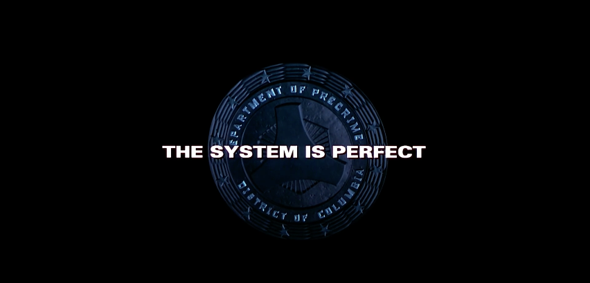
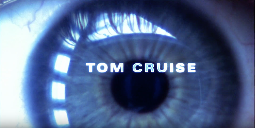
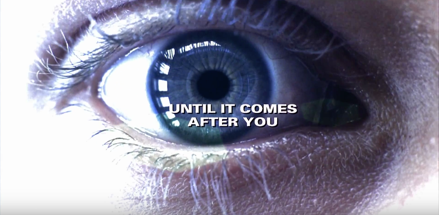
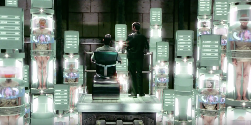
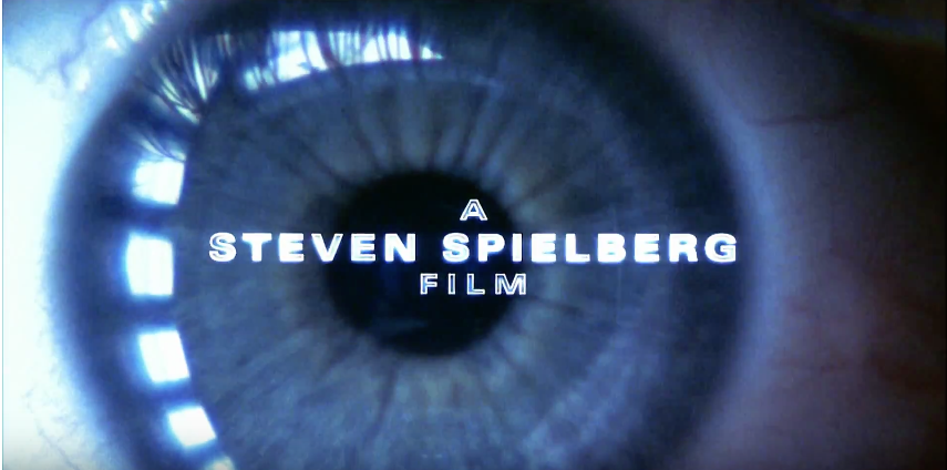
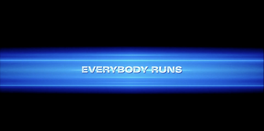
The trailer for Minority Report begins much like an action movie might, with its instantly fast paced beginning and shots of breaking through glass, pinning someone down and conveying their rights to them as though they are under arrest. In addition to this, we get an idea of the main character, as the first person we see speak gets the most screen time, with the camera focusing on him as he speaks. The audience gets to see straight away that Tom Cruise is in the movie, therefore attracting female audiences and fans of him, as he is a well known actor at this point. There is also a shot of a gadget being used, indicating a very action themed movie, or some of the sci-fi aspects as it is something we don't really recognise. This will attract audiences that are into gadgets, people that might enjoy the sci-fi genre. Then there are title cards, giving a little background on the type of world we are now in. This definitely indicates a sci-fi aspect, as well as perhaps distopia. And we get more background through the shot of the logo for the 'Department of Precrime' as it is explained what that is in one of the title cards, we get an idea of where the movie might be set, within the department. Also, the production company logos are designed to match the theme of the movie, being saturated of colour and adding a watcher effect over it. Another running image throughout is eyes. We see the protagonist scan the eyes of the man he pinned down, we see the eyes of a girl prominently. Common images make for a consistent trailer and suggest more themes of the movies. The movie remains pretty much fast paced, showing off action scenes, like fights, a lot of running, all in very quickly cut shots. The only time it really slows down is when an important line is stated, 'Everybody Runs' drawing the audience to this particular idea of people running away. This is even further emphasised by the tagline at the end saying exactly the same thing. To attract more fans of Tom Cruise, another title card is used, stating his name so that people know he will be in the movie. A similar card is used for Steven Spielberg as he is a well known director, a household name, which suggests a level of quality for the movie that people will expect from him. |
|
Crime Thriller
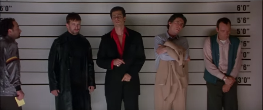
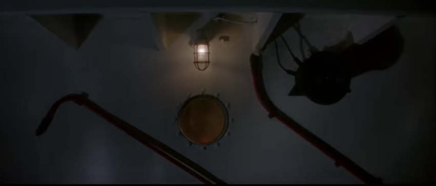
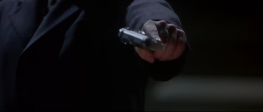
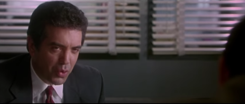
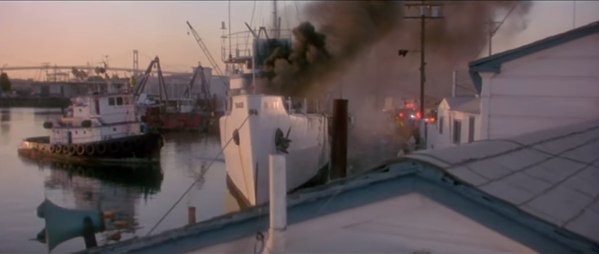
The Usual Suspects is a famous crime thriller from 1995, whose twist at the end is still considered one of the best in movies. It's trailer builds up suspense and doesn't reveal too much about the plot, which makes it interesting for an audience, perhaps inspiring them to go and see it. It begins quite medium paced, setting up the main location that the movie will revolve around- the boat- and the crime for which detectives are trying to find the perpetrator. Straight away we get conventions of crime movies, with guns, detectives, line ups, all the indicate to the audience what kind of movie this is and attracting an audience who will like that. The sounds also set the scene, with effects like creaking linking to the boat, and a very soft soundtrack which builds up to be very loud by the end of the trailer. The voiceover is very prominent in this trailer, as it speaks almost from the start, and repeats a very important word 'usually.' Before it has even stated that this is not the 'usual' case, we get that idea, from what we're seeing, from the character's dialogue and from the fact that the voiceover repeats it so much. It's effective in driving into the audience this idea that things are not 'Usual' linking to the title of the movie. Character's dialogue is hugely important here too, as we get a name that keeps coming up, which people describe as 'the devil' yet we never see him. This creates an enigma for the audience, who might go and watch the movie to find out who this person is. |
|
|
|
Disaster Thriller
The Day After Tomorrow is a Disaster movie from 2004. It's trailer begins with several strange occurrences that draw the audience in by showing them one after the other, showing that they are linked, therefore surprising. These are all linked with an eerie dip to black, then a fade into the next, strange shot. Before there is any dialogue, any introductions, the audience knows that something is up, and we even get an idea of a main character, as we see a close-up of their face reacting to the events, much like the audience. Then the pace slows right down and we get a long shot of someone talking on their phone. This makes us focus on what they are saying, then the most important part is emphasised by another dip to black and a closer shot of them as they speak. After that, the pace is faster and there are more action sequences with cool, shocking shots of tsunamis and famous landmarks being destroyed. The shock alone might make people want to see the movie, to find out why it looks as though their world is being destroyed. |
Posters
|
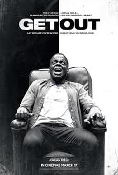
Get Out Poster
This first poster effectively presents one of the main themes of the movie, by splitting the background into one black side and one white side, perhaps representing racism and black vs white. And to add to this, the actual image is in black and white, which we may not see much anymore, as black and white is used as an effect if it is in movies, but on a poster, it would be more rare. It makes the image seem creepy and gets you to focus on the body language/facial expression of the character rather than what they are wearing or the colours around him. To hint at the movie's genre, this image of the character strapped to the chair is used, probably so that we know he is in some kind of danger, further supported by his facial expression. This poster is pretty simple, but effective in its layout. The title at the top is in black and white, alternating with the background so it can be seen. It also draws attention to it, emphasizing the scariness of the movie, as even it is telling you to 'Get Out.' Beneath that, the tagline is also styled like this as it breaks up your reading of it into two parts, 'just because you're invited... doesn't mean you're welcome.' It shows kind of what we believe and then the flip side of it. Just because one thing is true, doesn't mean you can jump to conclusions. On top of the title, there is some text detailing who directed the movie and which company produced it. This attracts audiences as they may know the director and be a fan, or the production company and like other movies they've produced. Both of these things suggest a level of quality, as people may have heard of the director and production company, think of the other movies they made and how good they were, then wonder if this movie will be of the same quality, which they can assume so. Below the main image, you get a reminder of the director, slightly larger than the previous one, and under that is the date it'll come out, which is important if people do want to go and see it. There is even a line of text under that which encourages the audiences to engage with the movie and spread the word about it, it says the website for the film. |
|
Minority Report Poster
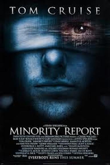
For Minority Report, the poster again relates to the common image of eyes, just as the trailer did, keeping both mediums consistent and bringing up this idea of being watched or seen for the audience. The colour is also saturated again, just like how the movie is shot, almost with a blue hue over it. While it is on one hand keeping with the colour palet of the movie, it again brings up another image of water, which was so important in the trailer. For this poster, the actor's name appears at the top of the main image, as he is well known and liked, suggesting a level of quality to his acting, as well as attracting fans of his. This is even slightly bigger than the title, making it seem more important, which it may be, as people might not have seen the trailer for this film, therefore may not know of the title, or care much about it, whereas they might want to see the film purely on the fact that Tom Cruise is in the movie, making it a better way to bring audiences is. Just like in the trailer, the director is named to bring in fans of his other movie and playing on this quality of his other movies. The tagline is a little less obvious than other movie posters, as it is quite low down and attached to the time in which the movie will be released. It is in bold, though, reminding the audience that 'EVERYBODY RUNS' adding to the creepiness of the movie. The vagueness of 'This Summer' builds hype as no one knows exactly when the movie will come out, so people may start talking about whether they want to go and see it. |
|
|
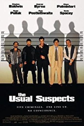
The Usual Suspects Poster
In the Usual Suspects poster, it utilities one of the most important and recognisable scenes from the movie, the line up, to hint at it's crime genre, as well as to show us all the main character's faces, as though we are picking who is guilty from among them. This attracts fans of these actors, while showing off its big cast, as well as having the names of them above them. Also, the shadows behind them could present that what they're getting into is bigger than all of them, as their shadows tower over them. The tagline here harks back to the trailer, where they speak about what is 'usual' with the line 'no coincidence.' The sort of countdown in the tagline could add to the suspense of the film, as it is counting down to finding out just why these five criminals were chosen for that line-up, and what they're getting themselves into. |
|
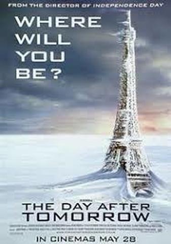
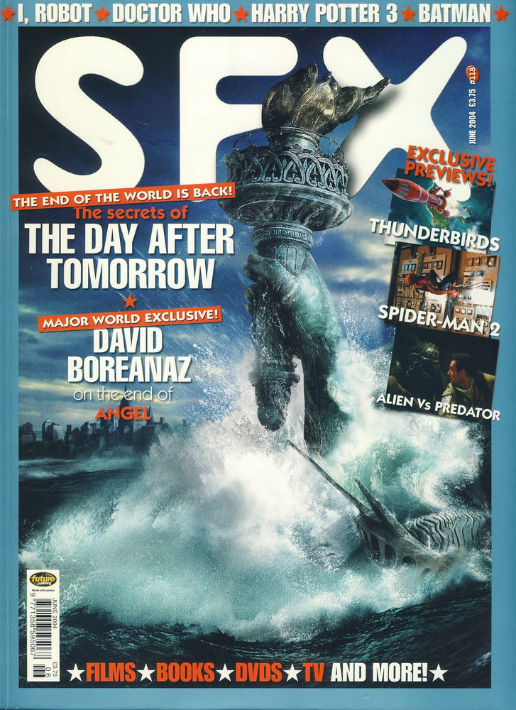
The Day After Tomorrow Poster
The Day After Tomorrow had several different posters, each with an image of a frozen over or destroyed version of recognisable landmarks, hinting at the genre of the movie, and adding the caption, 'Where Will You Be?' engaging the audience in the plot of the movie, as though the events may happen in real life and asking them where they would be when it happened. This is taken from the trailer, leading onto the title, as though both the trailer and poster are asking what will happen the day after tomorrow. These different posters connect with different people, due to its landmarks being in different countries, so people can see that the events of this movie will effect the world around. Above the tagline, it states the name of another movie that the director has made, a movie that was quite popular, so it attracts fans of that movie, and fans of that genre, as it was also kind of a disaster movie, mixed with sci-fi supernatural. Suggesting the quality of the director's work and attracting fans of the previous movie, it is a successful poster in getting people to come and see the movie. Also, with the date in large print below the credit block, it makes sure that people know when the movie is coming out, creating a buzz as people will prepare to go and see it, whether that be on the day it comes out, or in the weeks that follow. |
|
Magazine Covers
|
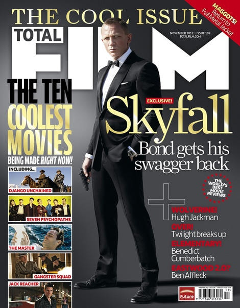
For this Total Film cover, advertising it's edition on the new James Bond film coming out at the time 'Skyfall' they used a picture of Daniel Craig with a very simple, grey background. While one colour backgrounds are not too often used as they look strange and boring, this one works, as it makes the shot look cold and cool, which we associate with the Bond character. It links to the Bond movies, perhaps even harking back to the credits sequence we've come to expect from a Bond movie, with it's intros often grey, black and white, showing off the girls in the movie and guns. The main image of Bond is quite simple, having Daniel Craig in a suit- which we expect from Bond- and a gun. Immediately, we think of James Bond, due to his previous movies, and it shows off the actor for fans of both the franchise and the actor himself.
Almost everything has a very cool, simple colour theme of Gold, grey and white. This makes the SKYFALL bit and THE COOL ISSUE stand out, reminding those who see it what movie it will be talking about, attracting those who perhaps want to see the movie or are fans of James Bond. This colours, like gold, remind us of the Bond movies. So the majority of this cover advertises the new movie, while its also advertising the other extracts in the magazine, with the next biggest text being THE TEN COOLEST MOVIES which is eye catching due to it conforming to the same colour theme, and being quite bold at the side of the page. This one uses small thumbnails of movies beneath that to show off some of 'the coolest moves being made right now' to attract other audiences to this magazine. |
|
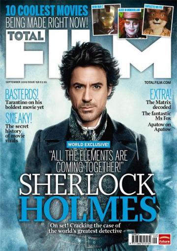
This Total Film cover advertises a new adaption of Sherlock Holmes. Again, the cover's colour theme sticks with the main image and the background by having the text either in shades of blue or white depending on what it needs to be able to stand out. As the name of the magazine isn't so important, the main image covers part of it, which most magazines do to advertise the actors in the movie. People who are fans of Robert Downey Jr may buy this magazine to see what movie he's doing now, while fans of Sherlock Holmes may buy it to see what this adaption is going to be like. While the image on its own doesn't directly link to Sherlock Holmes, as it is a new adaption and basically just a picture of Downey Jr in Victorian clothing, the title of the film is below it, with a line beneath it linking to Holmes again. Other things this film does includes a similar '10 coolest movies being made right now' which could be a running thing they do every month, but in this edition, it is being advertised above the title of the magazine, with shots overlapping each other with recognisable characters/actors to attract people who are fans of them or want to know more about the movies that will be coming out, creating a buzz for them as well as Sherlock Holmes.
|
|
|
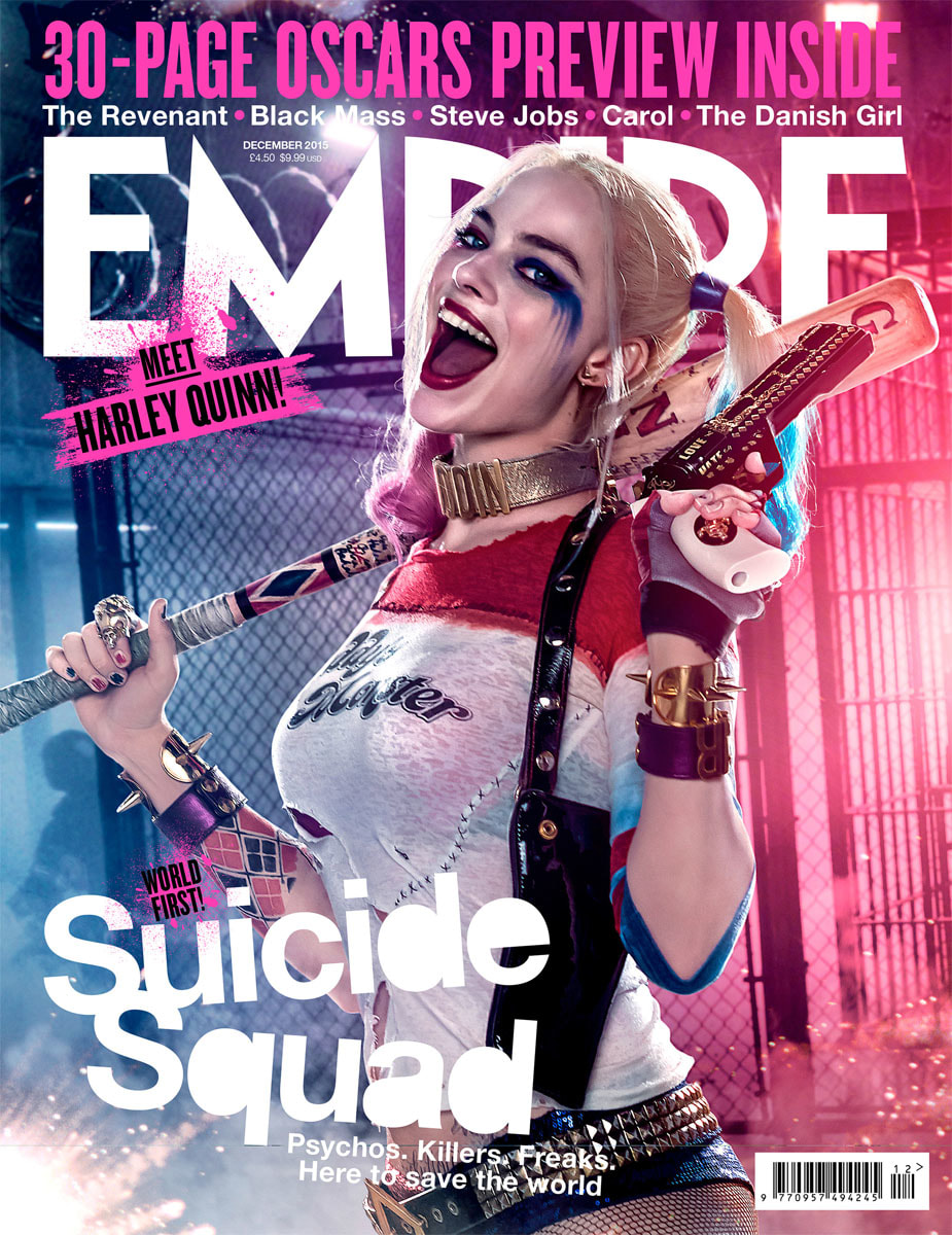
This cover of Empire magazine shows off the new incarnation of Harley Quinn for Suicide Squad. This one would be able to link back to source material, as it is from a comic book. The colours all link to the duel colours Harley Quinn is known for, so even if people do not recognise her as Harley Quinn straight away, the colours should help. The font used for the title of the movie obviously is the actual font used for it, but used here, it gives an idea of what the movie is going to be like, and it stands out, as it is the only text written like this. Other things advertised for on this cover is advertised above the name of the magazine, drawing attention to it by being in bright pink and bold, with quite contrasting white text underneath it, naming movies that people might've seen and want to read about,
|
|
